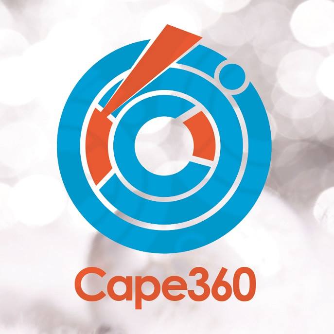
Cape360/www.cape360gh.com has officially released its official logo as part of its branding strategies for the coming years. The colours which was carefully chosen explains the motive behind the organization.
The orange colour represents innovation and modern thinking as well as carrying the connotation of youth, fun, affordability and approachability.
The Blue colour is a corporate one that implies professionalism, serious mindedness, integrity, sincerity and calm. Blue is also associated with authority and success.
The logo was designed by Kofi Ampah.
Cape360 is an organization that seeks to promote the region (Central), develop mindsets and talents, inspire the youth and older generations and provide wholesome entertainment for persons in the Region.
Cape 360 aims at revamping and re branding how the world perceives the region and products from herein, especially in the areas of Arts & Craft, Music & Entertainment, Education &Social issues, Business & Finance.
Cape360gh.com is an online platform, where the public can access information about all aspects of life in the central region.
Our top rated platform offers our clientele one-on-one attention and a tailored approach; designed to promote their product from all angles within their niche and beyond.
We wish you, the reader, a happy new year and a very good year.
Twitter : Cape360gh
FB :Cape360
IG: Cape360gh
Whatsapp : 0209411206
Youtube : Cape Threesixty
---
Date | 1st January, 2016
Source: www.cape360gh.com
